Fashion Made Accessible
SuvarnaRagam Clothing is a retail fashion store based in Trivandrum, Kerala, built on one powerful mission: bring premium, stylish, high-quality clothing to everyday people at genuinely affordable prices. The store had a loyal walk-in customer base — but zero digital presence, no way for customers to explore before visiting, and no internal system to manage operations efficiently.
My role was to design and develop a dual-surface product: a customer-facing storefront and an internal CRM dashboard — both tailored to people who are not technically savvy, working in a fast-paced retail environment.
Discovery & User Pain Points
Before opening Figma, I sat with the store owner and observed two walk-in sessions to understand real friction — not assumed problems. Two core challenges shaped every design decision that followed.
No Digital Presence
Customers had no way to browse the catalog or check availability before visiting — resulting in wasted trips and lost sales for a store that relies entirely on walk-ins.
Serving the Middle-Class Family
SuvarnaRagam's core audience — everyday middle-class families, working parents, students — needed a digital experience that felt warm, accessible, and never overwhelming. Not a luxury app. A trusted neighbourhood store, online.
Research Goals
With the pain points defined, three primary research goals guided all subsequent design and architecture decisions:
1. Simplify the Browse-to-Inquiry Journey: Understand how customers currently discover and evaluate clothing, then design the shortest possible digital path from browsing to a live conversation with the store.
2. Map Staff Operational Workflows: Shadow store staff to document actual inventory and billing workflows before designing any CRM screen — ensuring the tool mirrors real mental models rather than imposing foreign conventions.
3. Establish Accessibility Standards for a Diverse Audience: SuvarnaRagam serves customers across a wide age range (18–65+). Font scales, contrast ratios, and navigation patterns had to serve both smartphone-native young adults and older customers with limited mobile experience.
Design Strategy
The strategy anchored on a single core principle: reduce cognitive load at every interaction point. Whether a customer browses sarees on a 375px screen or a staff member logs a new shipment into the CRM dashboard, every screen had to feel immediately intuitive — no manual, no guessing.
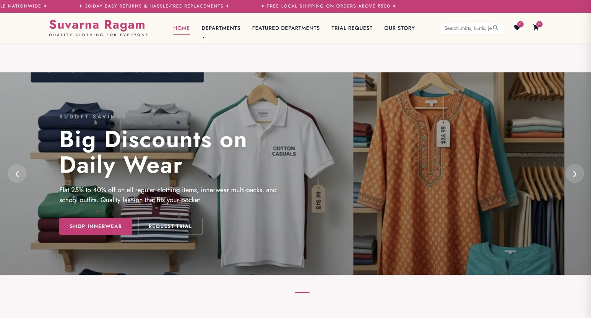
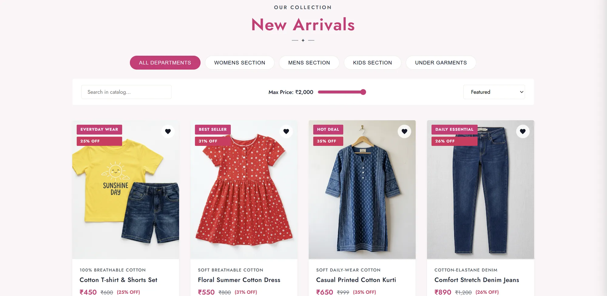
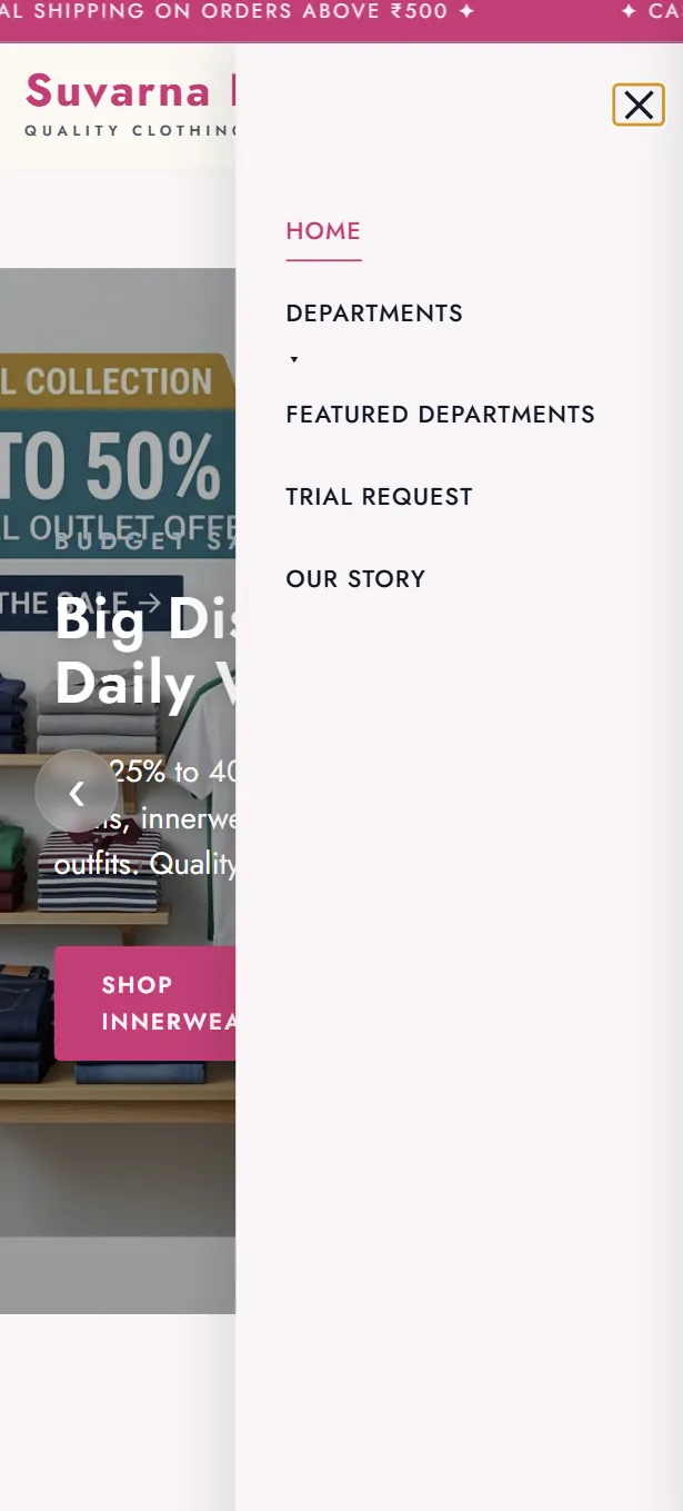
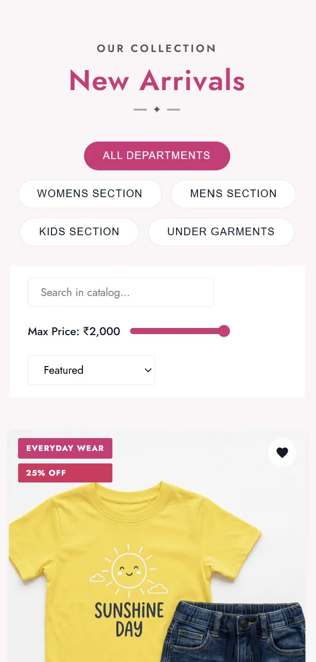
Mobile-first, always: Over 78% of the target demographic accesses the internet exclusively via smartphone. The storefront was designed at 375px width first and scaled upward — never adapted downward from desktop.
WhatsApp-first inquiry flow: Rather than building a conventional cart and checkout, the product detail page leads directly to a pre-filled WhatsApp message. The store's existing customer base was already comfortable with WhatsApp; removing payment infrastructure in v1 eliminated the biggest conversion barrier.
CRM simplicity as a feature: The internal dashboard was deliberately stripped to only three tasks in v1 — stock in, stock out, sales log. No dashboards, no analytics until the team builds confidence. Complexity grows with the team, not before.
Design System
A lightweight, scalable design system was built in Figma before any high-fidelity work began. This created a single source of truth for both surfaces — the customer storefront and the internal CRM — even though they operate at very different visual densities and interaction models.
Color Tokens
#7B1040
#C8336A
#F4EDE4
#ffffff
#1A1A1A
#888888
Typography Scale — Inter
Component Library: The Figma library houses 40+ reusable components — buttons in 4 states, text inputs, product cards (grid & list view), category pills, modal overlays, toast notifications, and CRM-specific data table rows with live status badges.
8px Spacing Grid: All spacing, padding, margins, icon sizes, and border radii derive from multiples of 8 — ensuring the system remains consistent through handoff and makes developer implementation predictable.
Key UX Design Decisions
Bottom Navigation on Mobile: Three navigation patterns were tested in low-fidelity user walkthroughs — hamburger menu, top nav bar, and a bottom tab bar. The bottom tab bar consistently produced the fastest task completion times. Users could reach Home, Catalog, Search, and Wishlist in a single thumb tap regardless of device size.
Progressive Disclosure in Catalog: Instead of exposing all filters and sub-categories upfront, the catalog starts with 6 curated sections. Filters expand inline on user request — reducing first-screen cognitive load significantly compared to full-filter-panel approaches common in larger e-commerce apps.
WhatsApp-First Inquiry CTA: Product detail pages lead directly to a pre-filled WhatsApp message rather than an add-to-cart flow. This removed the need for payment infrastructure in v1 and leveraged a communication channel the existing customer base already trusted and used daily.
Color-Coded Stock Status: The CRM surfaces stock levels through color alone — Green (In Stock), Amber (Low), Red (Out) — with no number reading required. Staff can scan a table row and understand inventory health in under a second.
CRM Dashboard Design
The internal CRM is deliberately structured around the three primary tasks staff perform every day: logging incoming stock, processing a sale, and reviewing daily totals. Each task maps to a dedicated screen with no cross-contamination of workflows — you never have to wonder which section you're in.
Stock In Module: A barcode-scan-friendly entry form with auto-fill for existing SKUs and clean manual entry for new items. Instant stock count preview updates as the form is filled, so staff see the outcome before confirming the entry.
Sales Log: One-tap sale entry with category auto-suggestion based on time-of-day trends and recently low-stocked items. Each entry generates a timestamped record exportable as a PDF receipt or a WhatsApp share link for customers who request it.
Daily Summary: Auto-generated at end of day — total units sold by category, revenue estimate, low-stock alerts, and top-moving items. One glance replaces a full manual tally.
Implementation Roadmap
The project follows a phased rollout strategy — shipping the highest-impact operational features first, then iterating toward a full e-commerce and analytics platform as the store team builds digital confidence.
Phase 1 — Discovery & Design System
Stakeholder interviews, in-store observation sessions, competitive audit, and the creation of the full Figma design system — color tokens, typography scale, icon set, and 40+ component library — plus lo-fi wireframes for both storefront and CRM.
Phase 2 — Storefront Hi-Fi Design
High-fidelity Figma prototypes for Homepage, Category Listing, Product Detail, Search, Wishlist, and the WhatsApp Inquiry flow. Full responsive coverage at 375px, 768px, and 1280px breakpoints.
Phase 3 — Frontend & Backend Development
Translating Figma designs to production HTML, CSS, and JavaScript. Building the Node.js + Express API, MongoDB schema for products and categories, and a WebP image optimization pipeline for fast mobile loading.
Phase 4 — CRM Dashboard Development
Building the staff-facing CRM: stock management module, sales logging, low-stock threshold alerts, customer contact database, and PDF/WhatsApp daily summary exports. Role-based access for owner vs. staff views.
Phase 5 — Beta Launch & Usability Testing
Internal beta with the store team over 2 weeks. 5-participant usability testing sessions, task completion rate tracking, error frequency analysis, and rapid iteration sprints before public launch.
Phase 6 — Public Launch & Analytics Integration
Full public launch with Google Analytics 4, WhatsApp inquiry conversion tracking, and an in-app feedback widget. 30-day post-launch monitoring with weekly performance reviews, then formal client handoff with documentation.
Building for Real People, Real Outcomes
Every architectural choice — Node.js, Express, MongoDB — was made with long-term scale in mind. The platform is lightweight, loads fast on mobile data, and is structured to accommodate future expansions: online ordering, a payment gateway, and WhatsApp Business API automation, all without requiring a rebuild.
The ultimate measure of success for SuvarnaRagam won't be a polished Dribbble shot. It'll be a staff member logging stock faster than they could write it in a register, and a customer in Kochi browsing a kurta at midnight and tapping "Enquire on WhatsApp" before they close the tab.