Building a Studio From the Ground Up
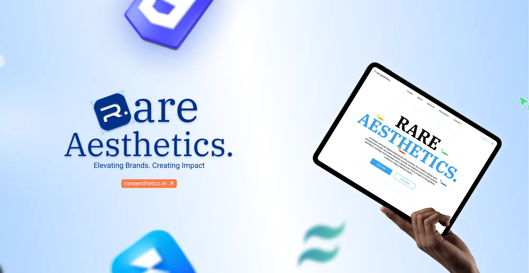
Rare Aesthetics is a personal design and development studio — founded by myself as a creative venture to bring premium digital experiences to life. It's not just a brand; it's a philosophy that design should feel intentional, refined, and unmistakably crafted.
The goal was to build a studio identity and website that reflects my core design principles: clean minimalism, bold typography, obsessive attention to detail, and a user experience that feels effortless. Every element — from the logo to the last hover state — needed to communicate quality before a single word was read.
The Pain Points
Before designing, I audited dozens of freelance portfolios and small studio websites to understand where they commonly fall short:
⚠ Generic Portfolio Syndrome
Most freelancer sites look identical — default templates, stock imagery, no distinct brand voice. They fail to differentiate the designer's own craft from the crowd.
⚠ Poor Mobile & SEO Performance
Heavy animations, unoptimized assets, and missing meta structures tank both mobile usability and search engine discoverability — the two channels clients actually use to find designers.
⚠ No Direct Contact Path
Contact forms buried in footers and no instant messaging integration mean potential clients leave before reaching out. A WhatsApp CTA or direct inquiry button drastically reduces friction.
⚠ Static, Lifeless Interfaces
Pages that feel like static documents rather than interactive experiences. No scroll-driven animations, no hover feedback, no micro-interactions — nothing that demonstrates the designer actually understands modern UI craft.
Defining the Brand Identity
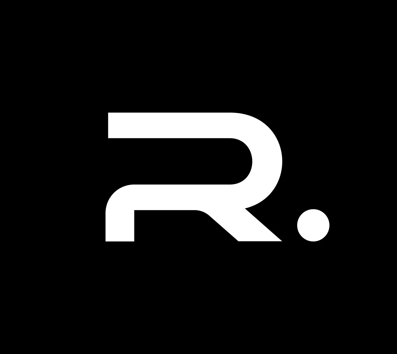
The branding process started with a deep exploration of what "rare" and "aesthetics" mean together. The name itself sets a high bar — the visuals had to match. I developed a clean, minimal logo system designed to work seamlessly across digital and print — a wordmark that balances geometric precision with subtle personality.
Design Strategy & UI Direction
The website strategy was built around three pillars: clean visual clarity, seamless responsiveness, and instant contact accessibility. Every design decision was filtered through these lenses.
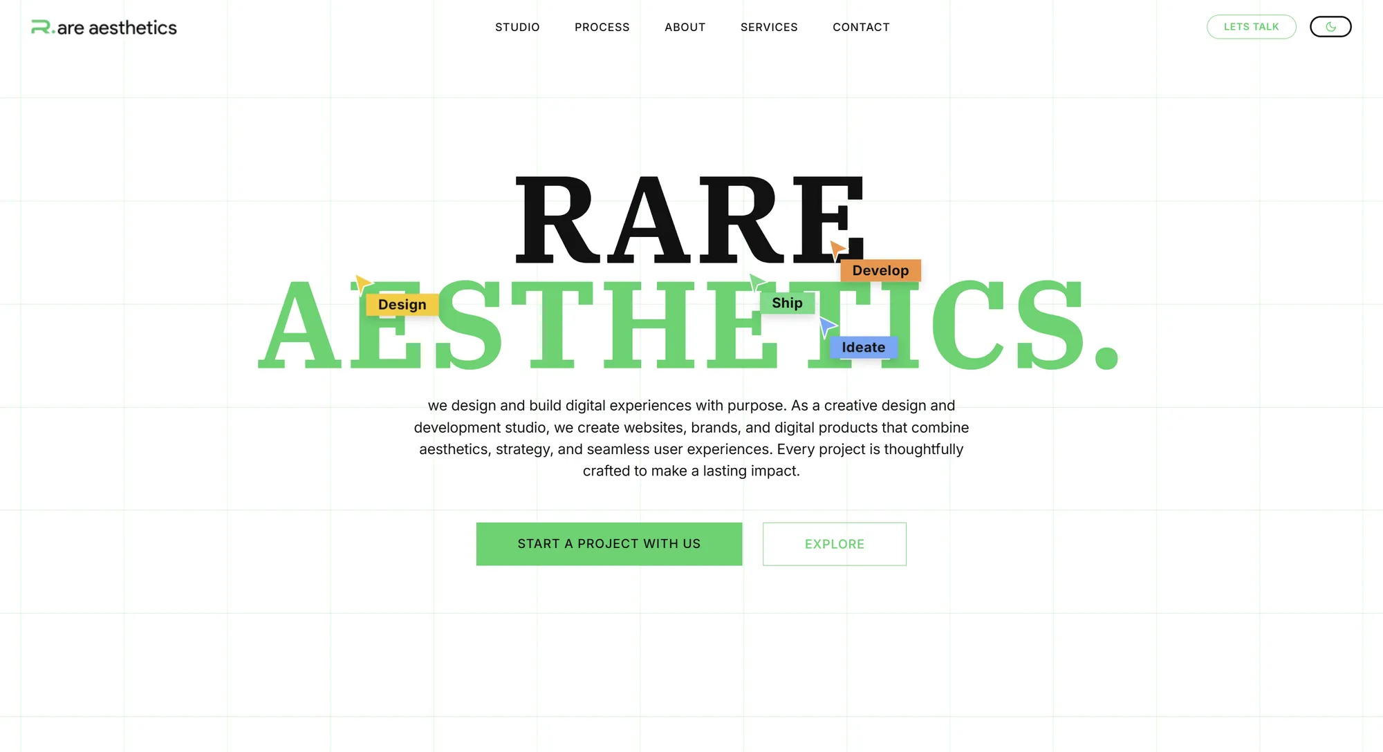
Clean UI: The interface uses a restrained palette of white, black, and carefully measured accent colours (blue, green, yellow, red) to create hierarchy without visual noise. Typography favours clean sans-serif families that stay legible at every scale while maintaining a strong editorial presence.
Navigation Design: The navigation bar was designed for intuitive access — easy-to-navigate menus with a clear visual hierarchy, a dark/light mode toggle for user preference, and prominent CTA buttons that guide visitors toward action. The nav adapts cleanly between desktop and mobile with a responsive hamburger menu.

WhatsApp CTA Integration: A persistent WhatsApp button was integrated as the primary contact channel — allowing potential clients to reach out instantly with a single tap, pre-filling a greeting message with the inquiry context. This dramatically reduces friction compared to traditional contact forms.
SEO-First Architecture: Every page was built with proper meta descriptions, semantic HTML5 structure, single H1 hierarchy, optimized image assets, and clean URL patterns. The site was engineered to perform well on both mobile and desktop from the ground up — not retrofitted after launch.
The Design System
Visual styles were systemized into a clean component library that maintains consistency across every page and interaction.
Brand Color Palette
#ffffff
#111111
#2563eb
#16a34a
#eab308
#dc2626
The Animated Hero Section
The hero section was designed to make an immediate visual statement. A clean, animated entrance — smooth fade-ins, fluid typography scaling, and a carefully composed layout that draws the eye naturally from the headline to the CTA. The animations are intentionally subtle: they enhance the experience without distracting from the content.
Interactive Process Section
One of the standout micro-interactions on the site is the process section — featuring a cursor-sensitive eye movement effect. As the eye-movement illustration detects mouse motion, the eyes follow the cursor direction, creating an engaging and playful moment.
This kind of detail is what separates a portfolio that shows design skill from one that merely tells about it. The interaction is lightweight, performant, and works seamlessly across both desktop and mobile.
.webp)
Implementation Roadmap
The project followed a focused execution path from brand discovery through to live deployment:
Phase 1 — Brand Identity & Visual System
Developing the logo, colour palette, typography stack, and component library in Figma. Establishing the design language that would carry across all touchpoints.
Phase 2 — High-Fidelity UI Design
Designing the full website layout in Figma — homepage, case study pages, about section, and contact flows. Iterating on desktop and mobile breakpoints simultaneously.
Phase 3 — Frontend Development & Animations
Building the responsive markup with HTML5, CSS3, and vanilla JavaScript. Implementing scroll-driven animations, the cursor-tracking eye effect, dark/light mode toggle, and WhatsApp CTA integration.
Phase 4 — SEO & Performance Optimization
Optimizing all assets, implementing proper meta tags and semantic HTML structure, testing mobile performance scores, and ensuring fast load times across devices.
Phase 5 — Launch & Iteration
Deploying the live site, monitoring analytics, and continuously refining based on real user behavior. Building the client portfolio and scaling the studio's service offerings.
What's Next
Rare Aesthetics is evolving. The studio is actively building its client portfolio, refining its service offerings, and growing into a full-service creative agency. The foundation is set — the brand identity, the website, and the design language are all in place. Now it's about scaling the vision and bringing premium design to more projects and more people.